UX: Some thoughts on User Experience - Joe Mabel
A lot of people use the terms "User Interface" (UI) and User Experience ("UX") interchangeably. I don't.
To me, UI is the "presentation layer" you interact with in your browser, app, etc. The presentation
layer is one of three
layers of a typical system, along with a "business logic layer" and a "data layer." The UI
to fulfill a particular purpose may be quite different on a PC than on a smartphone; for example,
Wikipedia's mobile app provides an UI that is quite different from on a PC, and especially
different if you want to edit an article.
UX, on the other hand, is the "whole package." UX includes things like:
- How quickly do web pages load?
- Can I find the information I need? Can I find it in a reasonable amount of time?
- Does the in-site search require me to be a perfect speller?
- Can I set preferences like, "Don't message me to say someone 'liked' my post, but message me if they wrote something in response"?
- How exactly can I successfully unsubscribe from getting eight emails a day from your business
u completely cutting off my relationship with you?
- Can I somehow deactivate or hide buttons for features that I personally never use and I could only ever hit by mistake?
UX also includes things that are not even particularly computer-related, e.g. "If I order something from your company
and there's a problem, will you be helpful?"
Good UX makes for a site that is a pleasure to use. Common tasks are easily achieved; if a particular common task is inherently difficult,
then a system with good UX guides you through it and, once you've mastered it, doesn't insist on continuing to guide you.
New features in the latest release still let you do familiar tasks the same way as before, or close enough that you aren't
at all confused. You can work out how to do things you rarely do without a phone call or chat session with their tech support
people (and without — worse yet — failing at the task because there is no apparent way to reach tech support).
Lately, I've been collecting examples of appalling UX (mostly, but not exclusively, UI examples). With one exception, the following
come from very major web sites that most of the
people reading this will at least occasionally have used. For obvious reasons, I do not name sites or companies here.
-
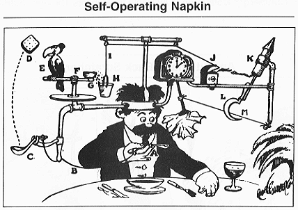 |
Rube Goldberg's "Self-Operating Napkin" (1931),
an insanely complicated solution incorporating
a parrot, a sickle, and a skyrocket,
among other elements. |
A well-known smartphone app "calls home" to its server so often that if you have it on your phone then even when you are not actively using this app,
you have to charge your phone twice as often as people who don't have it.
-
On the website of a company that makes online meetings possible, when you click to start a meeting, it typically takes several seconds to
launch their meeting app. In itself, that is OK, though not great. What I call "appalling" is that
there is no immediate feedback to let you know that you successfully clicked the button.
- On the same site:
- The "send an invitation" link might be the
most-clicked button on the site, but it is awkardly located halfway down the meeting page for each meeting
- The feature to copy meeting information to the
PC clipboard feels like it was designed by Rube Goldberg (see illustration).
- "Website A" loads multiple megabytes of extraneous graphics and user-tracking JavaScript before loading any of the (usually rather minimal) text
the user actually want to see; people with slow web connections typically have to reload each page two or three times, because page-loading times out.
- A social website has a dropdown of the user's recent conversations in reverse chronological order. However, the list updates
only on page refresh. If you resume the tenth conversation in the list, it remains tenth in the dropdown as long as you stay on the same page; once
you navigate to a new page, then the recently edited conversation comes to the top.
- "Website B" can have as many as three (maybe more) separate areas of the screen that can scroll, and no easy way to tell which one will be affected
if you use the scroll button on your mouse.
- A certain online encyclopedia can take several seconds after loading a page for buttons and links to settle
into their appropriate locations so that you can rely on clicking on the button or link that you meant to click on.
(I'm afraid that the site being "nameless" doesn't conceal identity here; it's OK, I'm an admin there.)
- There is a major site where some people cannot sign up for accounts because the site appears to have some sort of flaw in the process to send confirmation
emails, and no way to let anyone there know about the problem. The site in question makes its money primarily from people having accounts and paying
to use advanced features, so either they don't know about this problem or their accountants can't do math.
- "Website C" prominently shows an ad inviting people to set up an account. The ad is still there when you are logged in.
- Some pages on the tax website of a certain U.S. state do not offer a way to get back
to the home page, nor to log out. (I believe this is the only site or app mentioned here that most people won't have used.)
- Numerous sites seem to have decided that people sitting in front of a big computer screen of course
would like to have exactly the same experience as if they were on a little phone.
One more pet peeve: while not every site/application can accommodate every common disability — deaf people generally
don't download music; blind people don't do computer-aided design for architecture;
people with attention deficit disorders probably don't want to use Twitch —
most sites/apps should be able to do so, but few give it a moment's thought.
In many cases, if the site in question is in the United States, this actually violates the Americans with Disabilities Act (ADA), and
they are setting themselves up for a possible lawsuit. This does not mean "dumbing down" your site or app.
In most cases, the same things that would let people with disabilities use the site would also
provide a better experience to non-disabled users. A good example is right here on this page, where I describe the Rube Goldberg picture
in moderate detail so that someone who cannot see it will still get the point. The clear caption is good for others as well.
My availablility
I am retired from hands-on software development, but for me things like helping people avoid these pitfalls
constitute the fun part, so I still do it.
In a short (typically half-day or one-day) consulting session, I can help you design your site so that you don't make mistakes like this, or at least you
have processes in place so that you can spot mistakes soon after you make them and fix them promptly.
Mail me.
Copyright ©2020 Joseph L. Mabel
Unlike much other content on this site, if you wish to republish this elsewhere, please contact me first.
Originally posted December 22, 2020
Last modified: 23 February 2021My e-mail address is jmabel@joemabel.com. Normally, I
check this at least every 48 hours, more often during the working week.